

-
Overview
- Philosophy
- Color
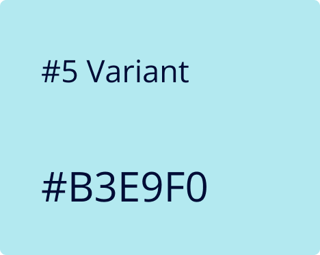
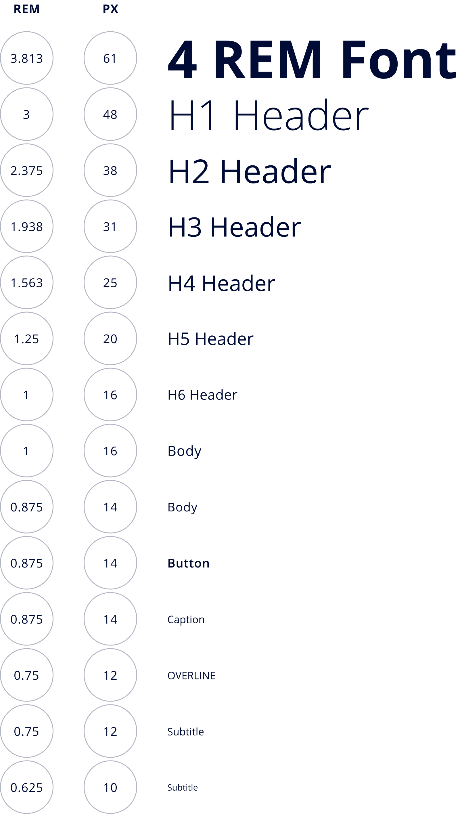
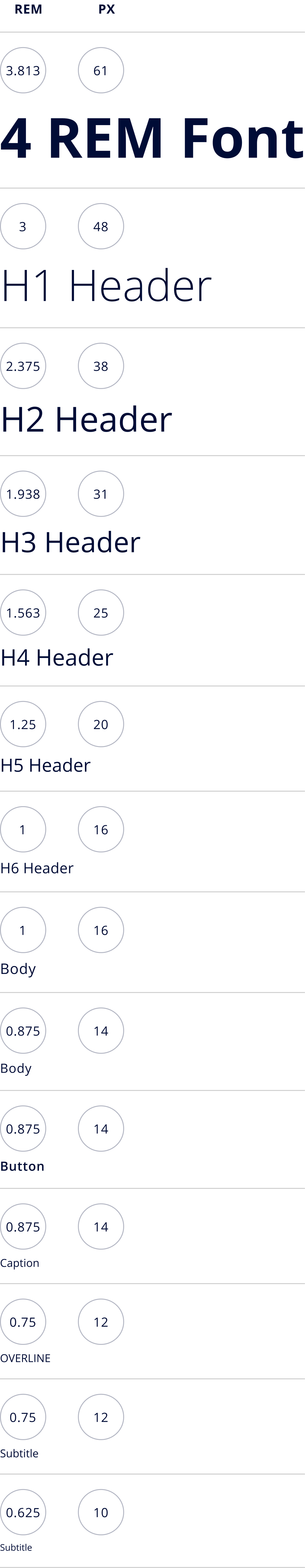
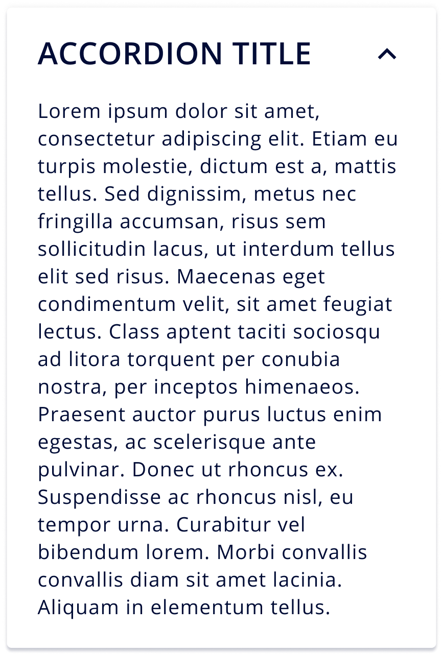
- Typography
-
Our Design Philosophy
As technology continues to advance at a rapid pace, it has become a growing necessity to achieve technological literacy in order to keep up with the pace of modern society. As designers, we strive to be the bridge between technology and humans through powerful, yet simplistic designs. Here at US AI, we embrace a human-centered design approach where we understand the problem and challenges users face, design an end to end experience, reimagine their workflow and ensure our product suite provides the best possible user experience to enrich our user’s day to day lives.
Collaboration
Collaboration is essential in our design process, not only between designers and developers, but also with our users. We believe that you cannot understand good design if you don’t understand the people. The best designs come from a deep empathy for the user, so we frequently get together with our clients to talk about their pain points, needs, and business goals which allows us to design solutions that cater to real-life experiences.
Simplicity
As German-born American painter Hans Hofmann once said “The ability to simplify means to eliminate the unnecessary so that the necessary may speak.” We emphasize utility through minimalistic design choices because good design is meant to be experienced, rather than seen.
Accessibility
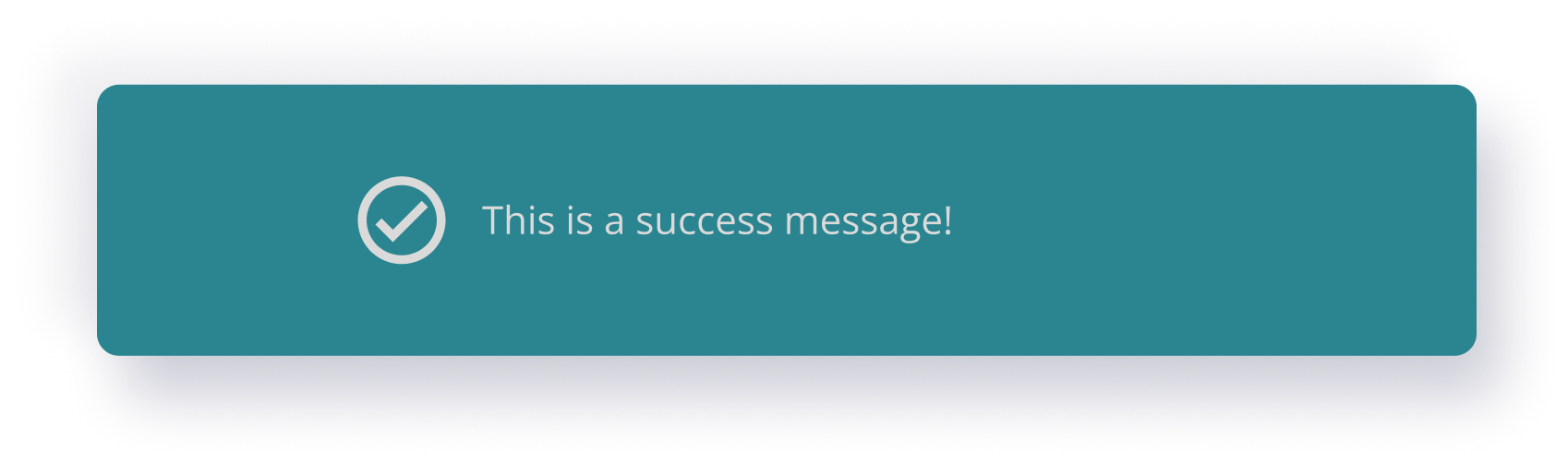
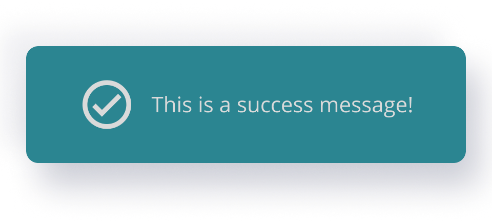
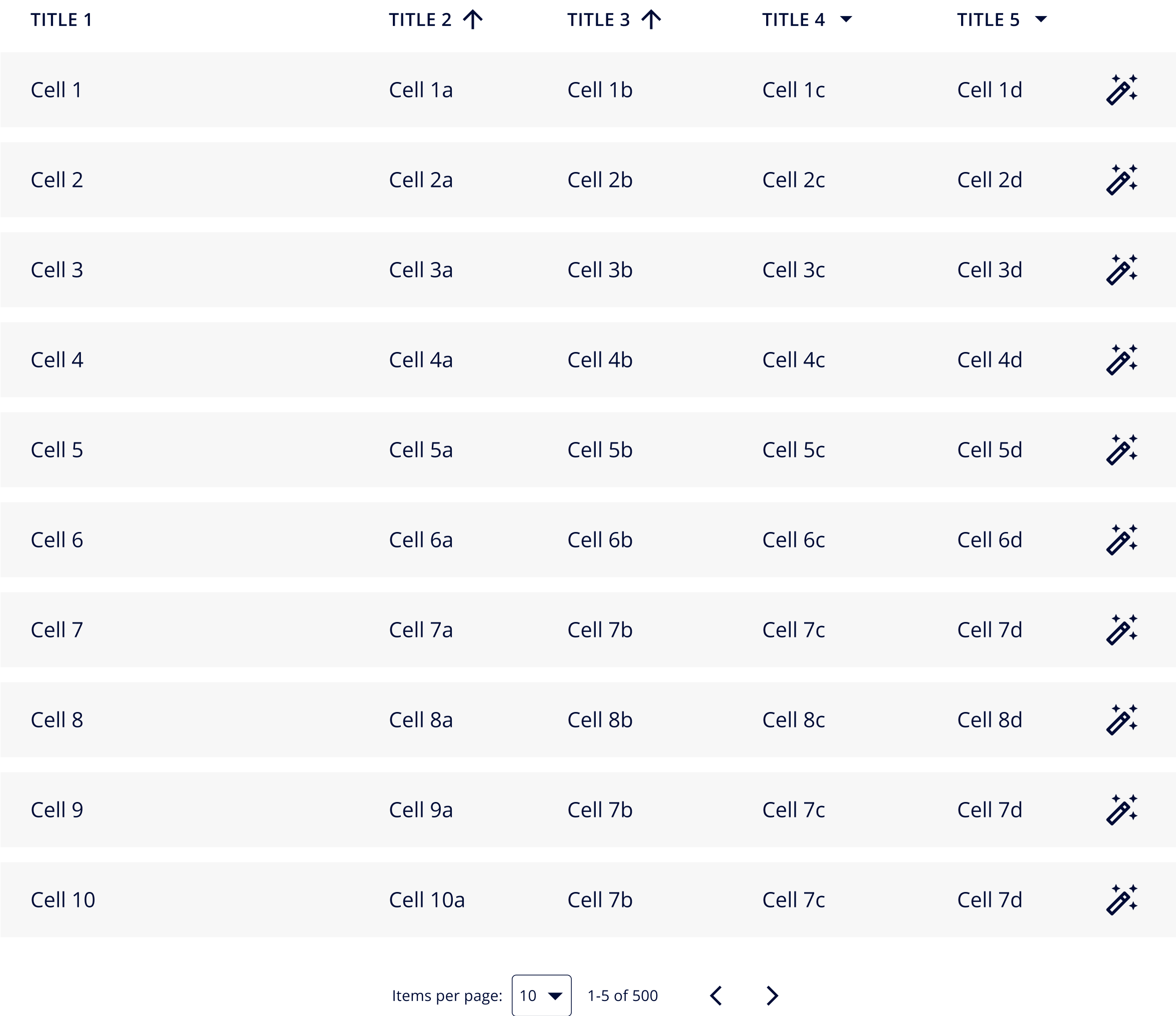
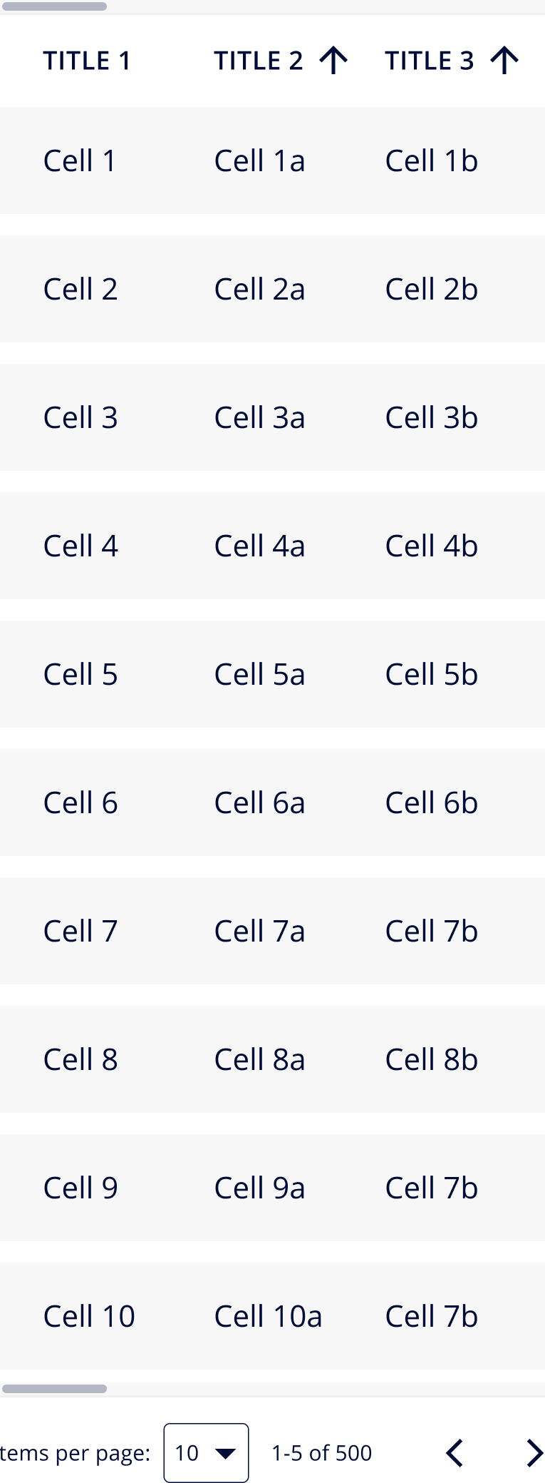
Frank Chimero, Brooklyn-based designer and author of The Shape of Design once said “People ignore design that ignores people.” Inclusive design eliminates barriers of use and empowers everyone to participate equally, confidently, and independently. We leverage our extensive design system and standards to ensure our designs are inclusive and accessible to a wide range of users.
Extreme Innovation
Our team is constantly pushing boundaries to think outside the box. Regardless of official occupations, everyone at US AI is a designer at heart. We encourage everyone to share their ideas, no matter how crazy they may be because openness breeds innovation. We aim to innovate so that we can solve problems before users even recognize they’re having them.
Continuous Improvement
Here at US AI, we are transparent in the way we share our work continuously to open opportunities for feedback and suggestions. It is important to design with humility and practice with an open heart to feedback as the old saying rings true, “Two brains (or a community in this case) are always better than one.” Our designs are deliberated across multiple teams prior to launch so that we may continuously improve and present a powerful solution.


